A. Background
Large data problems are inherently complex. The result is that I usually have to break problems down into chunks. In this post I investigate demographics that could be linked to the opioid epidemic in America.
All of my projects stem from personal curiosity but current events definitely influence my ideas. Last week, the Trump administration eluded that it would take a hard stance on recreational marijuana, reversing the decision of the Obama administration. In a press conference, Sean Spicer drew unsubstantiated links between the use of recreational marijuana and the opioid overdose epidemic. This contradicts evidence that the epidemic is caused by abuse of prescription opioids. In the words of the CDC, 'The best way to prevent opioid overdose deaths is to improve opioid prescribing to reduce exposure to opioids, prevent abuse, and stop addiction.' In fact, a recent infographic published by the CDC indicates that people addicted to prescription pain killers are 40x more likely to be addicted to heroine compared to just 2x for alcohol addiction and 3x for marijuana addiction.
The problem, for me, is not the threat of a marijuana crack down, it is the perpetuation of unsubstantiated claims that marijuana is a gateway drug to opioids. This is especially troubling considering that prescription opioids are significantly more likely to lead to an opioid addiction (and overdose) than weed. Additionally, medical marijuana could actually play a role in reversing the opioid epidemic. Spicer's sentiment reinforces the stigma that marijuana is dangerous and should be a schedule 1 drug. This stagnates research into cannabinoids for pain management and makes it taboo for people to seek marijuana as an alternative to opioids. Given the complexity of this problem, I decided to see if I could predict narcotics deaths based on socioeconomic demographics (including marijuana legality/sentiment). This is a simplification of a highly complex problem and is more of a thought experiment than a research project, so, please don't take the results as gospel.
B. Selecting Features
For this project, I recycled a number of the demographics from the U.S. maternal mortality project I did in January. The bullet point list was a little hard to look at so I re-organized the features into a table (see below).
1. Investigating New Variables
I have two new data sources: narcotics death data from the CDC (2015) and marijuana sentiment data from 2016. If you would like to learn more about any of the other data sources you can check out my full project write up for US maternal mortality rates here. Please note that feature data is generally from the years 2010 or newer with the exception of maternal mortality rates (2001-2006). Lets look take a look at how the two new demographics pan out across the United States.
The rank for marijuana enthusiasm starts with Colorado as 'most enthusiastic' and ends with North Dakota as 'least enthusiastic'.
According to the CDC, the data for narcotics deaths from North and South Dakota is 'unreliable'. Read more on the CDC website.
I used the code below to graph these choropleths with plotly. You will need your own plotly credentials to save your graphs online or you can choose to save them locally. I derived my code from this example on the plotly website.
import sys
sys.path.insert(0, '/Users/minire/dropbox/CS/keys')
import keys
print dir(keys)
import plotly.plotly as py
import plotly.tools as tls
tls.set_credentials_file(username=keys.pltusername, api_key=keys.pltapi_key)
import pandas as pd
import numpy as np
import requests

#importing data frame
path = "../code/"
opioids = pd.read_csv(path + 'compiled_opioid_data.csv')

# creating a choropleth graph for weed enthusiasm
data = [ dict(
        type='choropleth',
        #colorscale = scl,
        autocolorscale = True,
        locations = opioids['code'],
        z = opioids['weed enthusiasm rank'].astype(float),
        locationmode = 'USA-states',
        text = False,
        marker = dict(
            line = dict (
                color = 'rgb(255,255,255)',
                width = 2
            )
        ),
        colorbar = dict(
            title = "1 is most enthused"
        )
    ) ]

layout = dict(
        title = 'Weed Enthusiasm Rank 2016',
        geo = dict(
            scope='usa',
            projection=dict( type='albers usa' ),
            showlakes = True,
            lakecolor = 'rgb(255, 255, 255)',
        ),
    )

fig = dict(data=data, layout=layout)

py.image.save_as(fig, filename='weedenthused.png')</p>
2. Relationships in the Data
As always, overly correlated features can hurt your model. So, it is always good to start out with a correlation matrix of all of the features you plan to include. This way you can determine which features are redundant and make some decisions about what is best to leave out.
Red indicates a positive linear correlation, blue indicates a negative linear correlation.
Overall, the features have few strong correlations, however, some interesting things did show up: Teen Birth Rate per 1,000 live births is inversely correlated with median income (R^2 = -0.746086). This suggests that the more money a state has the fewer teen births there are . Another surprising correlation is found between abortion policy and marijuana enthusiasm (R^2 = 0.645330). As a reminder, the feature 'weed enthusiasm' ranks states with 'most enthusiastic' as '1' and the feature 'abortion policy rank' rates 'least barriers to abortion' as '1'. So, the most liberal state for both policies is given the lowest number. This is suggests that states that are anti-abortion are also less enthusiastic about marijuana usage. Producing this chart is really simple with Seaborn. You can see the code I used to produce the heat map below.
# Defining selected columns to be included in the heatmap
data_cols = ['weed enthusiasm rank', 'NormNarcDeaths','MMR', 'MedianIncome($)', 'Medicaid_extend_Pregnancy', 'economic distress', 'Teen Birth Rate per 1,000', 'PPR_White', 'PPR non-white ', 'Abortion_Policy_rank', 'State Taxes Per Capita', 'total exports']

#heat map
import seaborn as sns
sns.heatmap(opioids[data_cols].corr())
C. Building the model
1. Setup and Null Accuracy
For the first version of the model I decided to include all to the features from above. Once the model was optimized I removed some features to decrease the error further. The first step towards optimization is knowing what your null error is. I calculated null root mean squared error (RMSE) for Narcotics death as RMSE=4.61095354742. I used the mean of the response variable to determine the null RMSE with the code below.
# Null accuracy RMSE
def fillmean(x):
    if x != str:
        return opioids['NormNarcDeaths'].mean()
opioids['NNDmean'] = [fillmean(row) for row in opioids['NormNarcDeaths']]

# Calculate Null RMSE
from sklearn.metrics import mean_squared_error
score = mean_squared_error(opioids['NormNarcDeaths'], opioids['NNDmean'])
nullRMSE = np.mean(np.sqrt(score))

print 'Null RMSE: '
print nullRMSE
2. Tuning and Feature Importance
a. Defnining X and y: Once I calculated the null accuracy I started building my model. The first step is to identify for response variable and the features of your model:
# Defining X and y
# not optimized
feature_cols = ['total exports', 'weed enthusiasm rank', 'MedianIncome($)', 'economic distress', 'Teen Birth Rate per 1,000', 'PPR non-white ', 'State Taxes Per Capita', 'MMR', 'Abortion_Policy_rank', 'Medicaid_extend_Pregnancy', 'PPR_White']

# Define X and y
X = opioids[feature_cols]
y = opioids['NormNarcDeaths']
b. Model Selection and Estimator Tuning. Next I selected the proper model for my response variable. Given that this is a complex continuous response variable the RandomForest Regressor model was chosen. next I tuned the model for the ideal number of estimators and features:
# Importing random forest regressor for continuous variable
from sklearn import metrics
from sklearn.model_selection import cross_val_score
from sklearn.ensemble import RandomForestRegressor
rfreg = RandomForestRegressor()

# Tuning n-estimators
# List of values to try for n_estimators (the number of trees)
estimator_range = range(10, 310, 10)

# List to store the average RMSE for each value of n_estimators
RMSE_scores = []

# Use 5-fold cross-validation with each value of n_estimators (WARNING: SLOW!)
for estimator in estimator_range:
    rfreg = RandomForestRegressor(n_estimators=estimator, random_state=1)
    MSE_scores = cross_val_score(rfreg, X, y, cv=10, scoring='neg_mean_squared_error')
    RMSE_scores.append(np.mean(np.sqrt(-MSE_scores)))

# Plot n_estimators (x-axis) versus RMSE (y-axis)

import matplotlib.pyplot as plt
%matplotlib inline

plt.plot(estimator_range, RMSE_scores)
plt.xlabel('n_estimators')
plt.ylabel('RMSE (lower is better)')

# Show the best RMSE and the corresponding max_features
sorted(zip(RMSE_scores, estimator_range))[0]
Now that we know the ideal number of estimators (50) we can take a look at the features. In the next step we will look at the ideal number of features and the contribution of each feature to the model.
c. Feature Tuning
# Tuning max_features
# List of values to try for max_features
feature_range = range(1, len(feature_cols)+1)

# List to store the average RMSE for each value of max_features
RMSE_scores = []

# Use 10-fold cross-validation with each value of max_features (WARNING: SLOW!)
for feature in feature_range:
    rfreg = RandomForestRegressor(n_estimators=50, max_features=feature, random_state=1)
    MSE_scores = cross_val_score(rfreg, X, y, cv=10, scoring='neg_mean_squared_error')
    RMSE_scores.append(np.mean(np.sqrt(-MSE_scores)))

# Plot max_features (x-axis) versus RMSE (y-axis)
plt.plot(feature_range, RMSE_scores)
plt.xlabel('max_features')
plt.ylabel('RMSE (lower is better)')

# Show the best RMSE and the corresponding max_features
sorted(zip(RMSE_scores, feature_range))[0]
Tuning predicts the ideal number of features at 7 with an RMSE of 3.5. This is helpful but does not tell us which features we should include in our optimized model. To do this I computed the feature importances for all of the features.
d. Feature Importance
# Compute feature importances
features = pd.DataFrame({'feature':feature_cols, 'importance':rfreg.feature_importances_}).sort_values('importance', ascending=False)
print features
features.plot(x='feature', kind='bar')
The feature importances indicate that the majority of the predictive power of the model comes from the top 3 features.
Using the optimized features above with 20-fold cross validation I was able to get an un-optimized RMSE of 3.50146776799. Now that I have an idea of which features are important I can begin to optimize the model. This is done by restricting the features that are used. Usually, I would use the max features as a cut-off guideline, but I was able to get better performance by using fewer features. See the next section for the optimized model.
D. Model Optimization and Evaluation
1. Model Optimization
Utilizing the feature importances and the tuning strategies from above I was able to distill the features down to two: [ 'Teen Birth Rate per 1,000', 'total exports'].
# optimized
feature_cols = ['Teen Birth Rate per 1,000', 'total exports']

# Define X and y
X = opioids[feature_cols]
y = opioids['NormNarcDeaths']

# Compute feature importances
features = pd.DataFrame({'feature':feature_cols, 'importance':rfreg.feature_importances_}).sort_values('importance', ascending=False)

# Check the RMSE for a Random Forest Optimized features
rfreg = RandomForestRegressor(n_estimators=250, max_features=1, random_state=1)
scores = cross_val_score(rfreg, X, y, cv=20, scoring='neg_mean_squared_error')
allRMSE = np.mean(np.sqrt(-scores))
print allRMSE
print features
features.plot(x='feature', kind='bar')
Fitting the model with two features produced the feature importances seen above. With just these demographics the feature importance is even for both features.
2. Final RMSE and Model Evaluation
With the optimized RMSE I calculated how well the model improved over null RMSE:
- nullRMSE: 4.61095354742
- OptimizedRMSE: 3.23286248334
- Improvement: 1-(OptimizedRMSE/nullRMSE) = 0.298873334964 (or ~ 30%).
- out of bag accuracy score = 0.30322192270209503
E. Conclusions
Given the small amount of variation in narcotics deaths across the states, the accuracy did not improve by much when using the Random Forest Regressor. In the future, looking at the data with more granularity could improve the model (by county or city). Converting the variable from a continuous to classified could also improve the model. Although the out of bag accuracy score was quite low (30%) I was able to improve the model over the null be 30%.
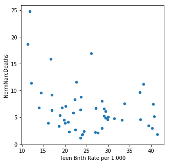
It is interesting to note that total agricultural exports and teen birth rates are the main predictive demographics. Neither are particularly well correlated with narcotics deaths (total exports (R^2 = -0.338059, teen birth rates R^2 = -0.354916). Both of these features were also predictive for maternal mortality rates.
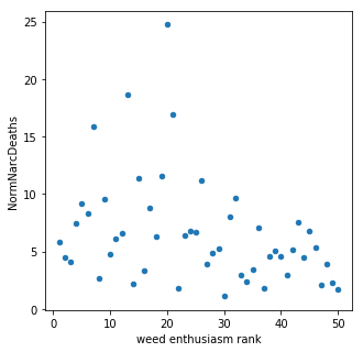
When all of the features were included in the model, marijuana sentiment accounted for ~10% of the model prediction. Through optimization this feature was removed along with a number of other demographics. In this model there doesn't appear to be much of a connection between marijuana sentiment (measured by legality and usage) and narcotics overdose corroborating with previous studies. However, this model is not very accurate and further study is needed to draw any definitive conclusions.
In my next post I will move away from cannabinoids and take a more holistic approach to investigating underlying trends in opioid prescriptions.


