Stanford SQL Exercises #100daysofcode #100daysofDataScience #Day27 #unicornassembly #netflixandcode

While working on the fundamentals (stats) I haven’t forgotten about keeping my tech skills sharp. Last week on Sunday I decided to take a break from z-scores and t-scores to do a little SQL practice. I’ve already blogged about my humble beginnings with SQL on Khan Academy but it’s nice to have a place to just write some queries without overhead.

The Stanford SQL Movie Rating Query Exercises provide just that! These were suggested to me by a friend prepping for Data Science interviews. It’s a great way to get your brain in SQL mode and to test your speed. SO, start the timer and see how fast you can go through ‘em!

Here are the queries that I found the most difficult with my #netflixandcode solutions. Admittedly a little clunky but it gets the job done

Question 6: For all cases where the same reviewer rated the same movie twice and gave it a higher rating the second time, return the reviewer's name and the title of the movie.

Screen Shot 2019-08-07 at 7.32.10 PM.png

Question 9: Find the difference between the average rating of movies released before 1980 and the average rating of movies released after 1980. (Make sure to calculate the average rating for each movie, then the average of those averages for movies before 1980 and movies after. Don't just calculate the overall average rating before and after 1980.)

Screen Shot 2019-08-07 at 7.33.13 PM.png

Statistics wizard in the making thanks to @khanacademy #100daysofdatascience #100daysofcode #Day20 #unicornassembly

Khan Academy puts the FUN in Fundamentals with the AP Stats Course

My Course Progress

My Course Progress

I rely heavily on internet courses and certifications to brush up on skills. Before using Khan Academy I thought of it as a study aid for kids. That changed when I was looking for a fundamental course on SQL. The Khan Academy SQL course was a god send and truly made for beginners. There were lots of practice problems in a structured environment with great feedback. Since then, I’ve played around in the calculus and computer science courses.

For #100daysofdatascience I’ve committed to running through the entire AP statistics course and then taking a mock exam at the end. The complete 2012 exam is posted online so that will be my go to. I am about halfway through the course and here are my thoughts so far:

I have used descriptive statistics pretty much everyday for the last decade. I regularly use inferential statistics and more complex descriptive statistics for modeling and machine learning. These tools are fundamental to hypothesis testing. It takes a lot of motivation to force yourself to go through subject matter you already know but the result is that I have a renewed confidence in my stats tool kit and a fresh grasp of the fundamentals. That said, I will warn that the course can be a bit frustrating at times. Occasionally the questions are a bit subjective or very strict on format of submissions. This is also true for the AP exam and doubly true for most online courses so it’s not especially surprising. It does make things go a bit slower, especially for a perfectionist that wants to get every question right!

The Long Road to Becoming a "Unicorn" #100daysofDataScience

Some Assembly Required

Data Science Venn Diagram by Drew Conway.

Data Science Venn Diagram by Drew Conway.

At some point I stumbled across Drew Conway’s Venn diagram of data science. In some versions you will see “data scientist” replaced with “unicorn”. That was my thought looking at this picture. Only a crazy person could or would be an expert in all three…But I’m a glutton for punishment and took this as a personal challenge. I found myself approaching each of these bubbles as you would course work for a major or degree. I built a little rubric in my head with internet courses to take and HackerRank problems to solve.

Fast forward a few years and I’ve realized this unicorn has a few more horns. In the business world, creating data insights and predictions without the ability to communicate those ideas makes you much less effective. It doesn’t discount the importance of the other three areas, it’s just an additional ingredient necessary for success. Stephan Kolassa highlights the need for communication skills in his update to the Conway Venn diagram.

 
Stephan Kolassa’s data scientist

Stephan Kolassa’s data scientist

I still think that Hacking Skills, Math & Statistics Knowledge and Substantive Expertise (shortened to "Programming", "Statistics" and "Business" for legibility) are important... but I think that the role of Communication is important, too. All the insights you derive by leveraging your hacking, stats and business expertise won't make a bit of a difference unless you can communicate them to people who may not have that unique blend of knowledge. —Stephan Kolassa

 
Disassembled Unicorn from frugal fun for boys and girls.

Disassembled Unicorn from frugal fun for boys and girls.

Luckily, communication of highly technical subject matter was covered exhaustively during my PhD. That training helped immensely but it means each project has another layer. It also expands the list of ‘topics to master’…my data science “course rubric” is growing. There are so many new skills to learn and so many little boxes on Kolassa’s diagram to color in!

So, I’ve decided to dedicate some time to data science topics for the next few months (#100daysofdatascience for #unicornassembly). I will post here about my successes (and failures) as I go!

Sacrificing Shampoo for Sustainability

Sustainability is important to me but lifestyle changes are never easy. To adopt new habits I have found that a strict 2 month 'cold turkey' period followed by a more realistic lifestyle adjustment works best. This year I decided to try my hand at D…

Sustainability is important to me but lifestyle changes are never easy. To adopt new habits I have found that a strict 2 month 'cold turkey' period followed by a more realistic lifestyle adjustment works best. This year I decided to try my hand at DIY shampoo, body wash and conditioner with products I already use at home. My hope is to use a Castile soap for most things (hands, body, hair, dishes) and just refill it from the bulk soap at the grocery store. This would drastically minimize my container waste! 

As great as it sounds, it's not necessarily easy and I was worried to commit to two months of potentially destroying my hair and skin. The last time I tried to use Castile soap as shampoo it just turned my hair into a tangle gnarled mess. This time I used a coconut milk recipe and apple cider vinegar rinse. After three weeks I'm still going strong! It's an adjustment but I think I can do this! If you're curious about my regimem please let me know, I'd be happy to do a longer post on the subject.

European Sprint

The last few weeks have been a blur! After a final busy week in design haven Barcelona (thanks Gaudi) we took off for a sprint tour of Europe. We started in London filling up on metropolitan culture and Yorkshire pudding. From there we found our way…

The last few weeks have been a blur! After a final busy week in design haven Barcelona (thanks Gaudi) we took off for a sprint tour of Europe. We started in London filling up on metropolitan culture and Yorkshire pudding. From there we found our way to Kinvara and the Cliffs of Moher. We ended our tour of the British isles in Dublin with a pint of Guiness and a shot of Teeling whiskey. From Dublin we flew to Berlin where we learned how to tear down walls (pictured) and build up tolerance. Our final stop in Mainz was filled with family, food and foolery. We were both working throughout the trip so our nights were filled with hacking (also train rides, plane rides, or in the backseat of the car). Stay tuned for my next project update!

Opioids in America - Part I: Taking a Critical Look at Administrative Claims

A. Background

Large data problems are inherently complex. The result is that I usually have to break problems down into chunks. In this post I investigate demographics that could be linked to the opioid epidemic in America. 

All of my projects stem from personal curiosity but current events definitely influence my ideas. Last week, the Trump administration eluded that it would take a hard stance on recreational marijuana, reversing the decision of the Obama administration. In a press conference, Sean Spicer drew unsubstantiated links between the use of recreational marijuana and the opioid overdose epidemic. This contradicts evidence that the epidemic is caused by abuse of prescription opioids. In the words of the CDC, 'The best way to prevent opioid overdose deaths is to improve opioid prescribing to reduce exposure to opioids, prevent abuse, and stop addiction.'  In fact, a recent infographic published by the CDC indicates that people addicted to prescription pain killers are 40x more likely to be addicted to heroine compared to just 2x for alcohol addiction and 3x for marijuana addiction. 

The problem, for me, is not the threat of a marijuana crack down, it is the perpetuation of unsubstantiated claims that marijuana is a gateway drug to opioids. This is especially troubling considering that prescription opioids are significantly more likely to lead to an opioid addiction (and overdose) than weed. Additionally, medical marijuana could actually play a role in reversing the opioid epidemic. Spicer's sentiment reinforces the stigma that marijuana is dangerous and should be a schedule 1 drug. This stagnates research into cannabinoids for pain management and makes it taboo for people to seek marijuana as an alternative to opioids. Given the complexity of this problem, I decided to see if I could predict narcotics deaths based on socioeconomic demographics (including marijuana legality/sentiment). This is a simplification of a highly complex problem and is more of a thought experiment than a research project, so,  please don't take the results as gospel. 


B. Selecting Features 

For this project, I recycled a number of the demographics from the U.S. maternal mortality project I did in January. The bullet point list was a little hard to look at so I re-organized the features into a table (see below). 

1. Investigating New Variables 

I have two new data sources: narcotics death data from the CDC (2015) and marijuana sentiment data from 2016. If you would like to learn more about any of the other data sources you can check out my full project write up for US maternal mortality rates here.  Please note that feature data is generally from the years 2010 or newer with the exception of maternal mortality rates (2001-2006). Lets look take a look at how the two new demographics pan out across the United States.  

 The rank for marijuana enthusiasm starts with Colorado as 'most enthusiastic' and ends with North Dakota as 'least enthusiastic'.

 The rank for marijuana enthusiasm starts with Colorado as 'most enthusiastic' and ends with North Dakota as 'least enthusiastic'.

According to the CDC, the data for narcotics deaths from North and South Dakota is 'unreliable'. Read more on the CDC website. 

According to the CDC, the data for narcotics deaths from North and South Dakota is 'unreliable'. Read more on the CDC website. 

I used the code below to graph these choropleths with plotly. You will need your own plotly credentials to save your graphs online or you can choose to save them locally. I derived my code from this example on the plotly website.  

import sys 
sys.path.insert(0, '/Users/minire/dropbox/CS/keys')
import keys
print dir(keys)
import plotly.plotly as py
import plotly.tools as tls
tls.set_credentials_file(username=keys.pltusername, api_key=keys.pltapi_key)
import pandas as pd
import numpy as np
import requests
  
#importing data frame 
path = "../code/"
opioids = pd.read_csv(path + 'compiled_opioid_data.csv')  

# creating a choropleth graph for weed enthusiasm
data = [ dict(
        type='choropleth',
        #colorscale = scl,
        autocolorscale = True,
        locations = opioids['code'],
        z = opioids['weed enthusiasm rank'].astype(float),
        locationmode = 'USA-states',
        text = False,
        marker = dict(
            line = dict (
                color = 'rgb(255,255,255)',
                width = 2
            )
        ),
        colorbar = dict(
            title = "1 is most enthused"
        )
    ) ]

layout = dict(
        title = 'Weed Enthusiasm Rank 2016',
        geo = dict(
            scope='usa',
            projection=dict( type='albers usa' ),
            showlakes = True,
            lakecolor = 'rgb(255, 255, 255)',
        ),
    )

fig = dict(data=data, layout=layout)

py.image.save_as(fig, filename='weedenthused.png')</p>

2. Relationships in the Data 

As always, overly correlated features can hurt your model. So, it is always good to start out with a correlation matrix of all of the features you plan to include. This way you can determine which features are redundant and make some decisions about what is best to leave out. 

Red indicates a positive linear correlation, blue indicates a negative linear correlation.&nbsp;

Red indicates a positive linear correlation, blue indicates a negative linear correlation. 

Overall, the features have few strong correlations, however, some interesting things did show up: Teen Birth Rate per 1,000 live births is inversely correlated with median income (R^2 = -0.746086). This suggests that the more money a state has the fewer teen births there are . Another surprising correlation is found between abortion policy and marijuana enthusiasm (R^2 = 0.645330). As a reminder, the feature 'weed enthusiasm' ranks states with 'most enthusiastic' as '1' and the feature 'abortion policy rank' rates 'least barriers to abortion' as '1'. So, the most liberal state for both policies is given the lowest number. This is suggests that states that are anti-abortion are also less enthusiastic about marijuana usage. Producing this chart is really simple with Seaborn. You can see the code I used to produce the heat map below. 

# Defining selected columns to be included in the heatmap 
data_cols = ['weed enthusiasm rank', 'NormNarcDeaths','MMR', 'MedianIncome($)', 'Medicaid_extend_Pregnancy', 'economic distress', 'Teen Birth Rate per 1,000', 'PPR_White', 'PPR non-white ', 'Abortion_Policy_rank', 'State Taxes Per Capita', 'total exports']

#heat map 
import seaborn as sns 
sns.heatmap(opioids[data_cols].corr())
 

C. Building the model 

1. Setup and Null Accuracy

For the first version of the model I decided to include all to the features from above. Once the model was optimized I removed some features to decrease the error further. The first step towards optimization is knowing what your null error is. I calculated null root mean squared error (RMSE) for Narcotics death as RMSE=4.61095354742. I used the mean of the response variable to determine the null RMSE with the code below. 

# Null accuracy RMSE
def fillmean(x):
    if x != str:
        return opioids['NormNarcDeaths'].mean()
opioids['NNDmean'] = [fillmean(row) for row in opioids['NormNarcDeaths']]

# Calculate Null RMSE 
from sklearn.metrics import mean_squared_error
score = mean_squared_error(opioids['NormNarcDeaths'], opioids['NNDmean'])
nullRMSE = np.mean(np.sqrt(score))

print 'Null RMSE: ' 
print nullRMSE 

2. Tuning and Feature Importance 

a. Defnining X and y: Once I calculated the null accuracy I started building my model. The first step is to identify for response variable and the features of your model: 

# Defining X and y 
# not optimized
feature_cols = ['total exports', 'weed enthusiasm rank', 'MedianIncome($)', 'economic distress', 'Teen Birth Rate per 1,000', 'PPR non-white ', 'State Taxes Per Capita', 'MMR', 'Abortion_Policy_rank', 'Medicaid_extend_Pregnancy', 'PPR_White'] 

# Define X and y
X = opioids[feature_cols]
y = opioids['NormNarcDeaths']

b. Model Selection and Estimator Tuning. Next I selected the proper model for my response variable. Given that this is a complex continuous response variable the RandomForest Regressor model was chosen. next I tuned the model for the ideal number of estimators and features: 

# Importing random forest regressor for continuous variable 
from sklearn import metrics 
from sklearn.model_selection import cross_val_score
from sklearn.ensemble import RandomForestRegressor 
rfreg = RandomForestRegressor()

# Tuning n-estimators 
# List of values to try for n_estimators (the number of trees)
estimator_range = range(10, 310, 10)

# List to store the average RMSE for each value of n_estimators
RMSE_scores = []

# Use 5-fold cross-validation with each value of n_estimators (WARNING: SLOW!)
for estimator in estimator_range:
    rfreg = RandomForestRegressor(n_estimators=estimator, random_state=1)
    MSE_scores = cross_val_score(rfreg, X, y, cv=10, scoring='neg_mean_squared_error')
    RMSE_scores.append(np.mean(np.sqrt(-MSE_scores)))

# Plot n_estimators (x-axis) versus RMSE (y-axis)

import matplotlib.pyplot as plt
%matplotlib inline

plt.plot(estimator_range, RMSE_scores)
plt.xlabel('n_estimators')
plt.ylabel('RMSE (lower is better)')

# Show the best RMSE and the corresponding max_features
sorted(zip(RMSE_scores, estimator_range))[0]


Now that we know the ideal number of estimators (50) we can take a look at the features. In the next step we will look at the ideal number of features and the contribution of each feature to the model.  


c. Feature Tuning

# Tuning max_features
# List of values to try for max_features
feature_range = range(1, len(feature_cols)+1)

# List to store the average RMSE for each value of max_features
RMSE_scores = []

# Use 10-fold cross-validation with each value of max_features (WARNING: SLOW!)
for feature in feature_range:
    rfreg = RandomForestRegressor(n_estimators=50, max_features=feature, random_state=1)
    MSE_scores = cross_val_score(rfreg, X, y, cv=10, scoring='neg_mean_squared_error')
    RMSE_scores.append(np.mean(np.sqrt(-MSE_scores)))
    
# Plot max_features (x-axis) versus RMSE (y-axis)
plt.plot(feature_range, RMSE_scores)
plt.xlabel('max_features')
plt.ylabel('RMSE (lower is better)')  

# Show the best RMSE and the corresponding max_features
sorted(zip(RMSE_scores, feature_range))[0]


Tuning predicts the ideal number of features at 7 with an RMSE of 3.5. This is helpful but does not tell us which features we should include in our optimized model. To do this I computed the feature importances for all of the features. 


d. Feature Importance

# Compute feature importances 
features = pd.DataFrame({'feature':feature_cols, 'importance':rfreg.feature_importances_}).sort_values('importance', ascending=False)
print features
features.plot(x='feature', kind='bar')
The feature importances indicate that the majority of the predictive power of the model comes from the top 3 features.&nbsp;

The feature importances indicate that the majority of the predictive power of the model comes from the top 3 features. 

Screen Shot 2017-03-03 at 8.34.14 PM.png

Using the optimized features above with 20-fold cross validation I was able to get an un-optimized RMSE of 3.50146776799. Now that I have an idea of which features are important I can begin to optimize the model. This is done by restricting the features that are used. Usually, I would use the max features as a cut-off guideline, but I was able to get better performance by using fewer features. See the next section for the optimized model. 


D. Model Optimization and Evaluation  

1. Model Optimization

Utilizing the feature importances and the tuning strategies from above I was able to distill the features down to two: [ 'Teen Birth Rate per 1,000', 'total exports'].

# optimized                  
feature_cols = ['Teen Birth Rate per 1,000', 'total exports'] 
   
# Define X and y
X = opioids[feature_cols]
y = opioids['NormNarcDeaths']

# Compute feature importances 
features = pd.DataFrame({'feature':feature_cols, 'importance':rfreg.feature_importances_}).sort_values('importance', ascending=False)

# Check the RMSE for a Random Forest Optimized features
rfreg = RandomForestRegressor(n_estimators=250, max_features=1, random_state=1)
scores = cross_val_score(rfreg, X, y, cv=20, scoring='neg_mean_squared_error')
allRMSE = np.mean(np.sqrt(-scores))
print allRMSE
print features
features.plot(x='feature', kind='bar')
Fitting the model with two features produced the feature importances seen above. With just these demographics the feature importance is even for both features.

Fitting the model with two features produced the feature importances seen above. With just these demographics the feature importance is even for both features.

Screen Shot 2017-03-03 at 8.59.24 PM.png

2. Final RMSE and Model Evaluation

With the optimized RMSE I calculated how well the model improved over null RMSE:

  • nullRMSE: 4.61095354742
  • OptimizedRMSE: 3.23286248334
    • Improvement: 1-(OptimizedRMSE/nullRMSE) = 0.298873334964 (or ~ 30%).
    • out of bag accuracy score = 0.30322192270209503
 

E. Conclusions 

Given the small amount of variation in narcotics deaths across the states, the accuracy did not improve by much when using the Random Forest Regressor. In the future, looking at the data with more granularity could improve the model (by county or city). Converting the variable from a continuous to classified could also improve the model.  Although the out of bag accuracy score was quite low (30%) I was able to improve the model over the null be 30%. 

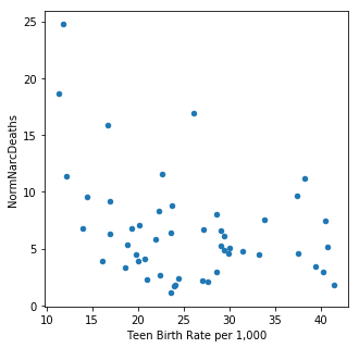
It is interesting to note that total agricultural exports and teen birth rates are the main predictive demographics. Neither are particularly well correlated with narcotics deaths (total exports (R^2 = -0.338059, teen birth rates R^2 = -0.354916). Both of these features were also predictive for maternal mortality rates.

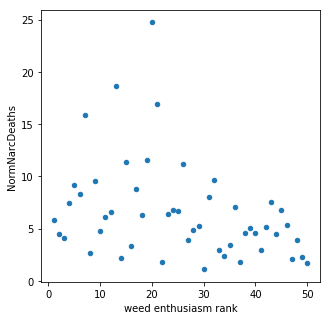
When all of the features were included in the model, marijuana sentiment accounted for ~10% of the model prediction. Through optimization this feature was removed along with a number of other demographics. In this model there doesn't appear to be much of a connection between marijuana sentiment (measured by legality and usage) and narcotics overdose corroborating with previous studies. However, this model is not very accurate and further study is needed to draw any definitive conclusions.  

NND_Weed_scatterplot.png

In my next post I will move away from cannabinoids and take a more holistic approach to investigating underlying trends in opioid prescriptions. 

A month in Barcelona

After years of trying to learn new languages (and failing) I decided to find a job abroad where I can practice. I don't have anything permanent yet, but for the next month I am living in Barcelona! I'm practicing my Spanish and hunting for a job. This is our adorable little flat on 'the hill' north of Gracia. Exciting things are to come! Also, stay tuned for my next data project!

Maternal Mortality Rates in the US

A. Background

My interest in data science comes from years of analyzing small self-generated datasets. The information eked from those experiments was invigorating and exciting but I quickly realized that self-generated data doesn't scale. This, taken together with the practically limitless supply of public data just waiting to be analyzed, convinced me to learn data science. I am personally interested in drug re-purposing, genetics and public health so I started there. I recently developed a model to investigate demographics contributing to global maternal mortality rates and decided to continue this project for the United States. 

Created with Plotly. High maternal mortality rates are above 14 maternal deaths per 100,000 live births, low rates are less than 7 maternal deaths per 100,000 live births. Data for MMR were collected between 2001 and 2006.&nbsp;

Created with Plotly. High maternal mortality rates are above 14 maternal deaths per 100,000 live births, low rates are less than 7 maternal deaths per 100,000 live births. Data for MMR were collected between 2001 and 2006. 

In the literature,  the focus is usually on tackling low hanging fruit to reduce MMR. The suggestions usually aim to increase access to clinicians, emergency services and prenatal education. Most of these interventions help substantially in countries with poor medical access and infrastructure. However, the United States, which has one of the most expensive health care systems in the world, has an abysmally high maternal mortality rate. By my calculations, our average MMR of 14 deaths per 100,000 births put us in 46th place out of 188 countries. That is right behind Qatar (45th) and just ahead of Uruguay (47th).

This poor performance is emphasized by the fact that these deaths are almost entirely preventable. It should also be noted that in some states MMR is at or below the global minimum. Unfortunately, other states have MMRs as high as 20 women per 100,000 live births. So why is this still a problem in the U.S.? Why are we behind other rich post-industrialized countries? I took a stab at developing a model to shed some light on the problem. You can see the full project write up as an ipython notebook on my github or read the brief summary below. 


B. Selecting Features 

Correlation Matrix

This heat map shows the correlations of each of the features and the response variable. Notice that median income is highly correlated with teen birth rate, percent of medicaid paid births and percent obesity in women. &nbsp;

This heat map shows the correlations of each of the features and the response variable. Notice that median income is highly correlated with teen birth rate, percent of medicaid paid births and percent obesity in women.  

Highly correlated features are redundant and were paired down to simplify and improve the accuracy of the model. In this case, removing the features that correlate with teen birth rate improved the model accuracy. The following features were included in the models (for detailed descriptions of the feature variables please see project documentation on github): 

Feature Choropleths and Descriptions

Made with Plotly. Darker color always corresponds to higher value. For more info about each feature see code descriptions below.&nbsp;

Made with Plotly. Darker color always corresponds to higher value. For more info about each feature see code descriptions below. 

  • 'MMR' - Maternal Mortality Rate (MMR) per 100,000 live births.
  • MedianIncome - Median household income in US dollars. 
  • 'Medicaid_Extend_Pregnancy' - Does Medicaid cover pregnancy costs? (yes: 1, no: 0)
  • 'Economic Distress' - Rank of economic distress across all factors (based on foreclosures, unemployment and food stamp usage) 
  • 'Teen Birth Rate per 1,000' - The number of births (per 1,000 live births) to teenagers aged 15-19 
  • 'PPR_White' - Proportional poverty rate of caucasians (Poverty of caucasians compared to the proportion of caucasians in the general population)
  • 'PPR Non-White ' -  Proportional poverty rate of NON-caucasians (Poverty of NON-caucasians compared to the proportion of NON-caucasians in the general population)
  • 'Abortion_Policy_Rank' - Rank of Abortion policy across all factors (1 - least barriers to abortion, 50 - most barriers to abortion)
  • 'Pill_InsurePol' - State legislation for insurers to cover contraceptives (0 - no coverage policy, 3 - meets coverage policy) 
  • 'EC_Access' - State legislation for accessibility to emergency contraceptives (0 - no policy, 3 - pro accessibility policy
  • 'State Taxes Per Capita' - Includes property taxes, income taxes, sales tax and other taxes per capita in US dollars ($)
  • 'Total Exports' - measure of total agricultural exports 
 

C. Evaluating Model

Response Variables: 

  • MMR - The continuous MMR variable is the rate of maternal deaths per 100,000 live births. The random forest regressor model with this response variable.

  • MMR Classifier - In this response variable the MMRs were mapped to a scale from 1-4 based on quartile rank. ( highest MMR - 4, lowest MMR- 1). The random forest classifier model was used with this response variable.    

Model Evaluation

Random Forest Regressor: 

  • Null RMSE (comparing average MMR and MMR100K): 4.921
  • RMSE for all demographics (max features=9, CV=20, estimators=170): 4.200
  • Improvement of ~15% over the null RMSE 

Random Forest Classifier:

  •  Null Accuracy: 0.26
  • Random Forest Classifier Accuracy (n_estimators=300, max features=1, and cross val=10) : 0.43
  • Improvement of ~40% over null accuracy  


D. Conclusions

"Teen birth rates per 1,000 live births had the highest feature importance."

Created with Plotly. Teen (15-19)&nbsp;birth rates per 1,000 live births are from 2014. Data from the Kaiser Family Foundation.&nbsp;

Created with Plotly. Teen (15-19) birth rates per 1,000 live births are from 2014. Data from the Kaiser Family Foundation


Feature importance ranks are shown below for the random forest classifier. The teen birth rate per 1,000 births has the highest feature importance. This feature accounts for variation in the MMR response variable and is a predictive feature of the model. Proportional poverty for people of color is also high on the list. Total agricultural exports, state taxes per-capita and abortion policy rank are other important features of the model.  

Feature importance:
*    Teen Birth Rate per 1,000    0.133484
*    PPR non-white    0.126148
*    total exports    0.123436
*    State Taxes Per Capita    0.121812
*    Abortion_Policy_rank    0.120240
*    economic distress    0.113177
*    PPR_White    0.107429
*    Pill_InsurePol    0.064076
*    EC_access    0.051818
*    Medicaid_extend_Pregnancy    0.038380


Discussion: 

Given the small amount of variation in MMR accross the states, the accuracy did not improve much when using the Random Forest Regressor. Once the MMRs were classified into quartiles the random forest model performed better. The final accuracy score for the random forest classifier improved over the null by ~40%. The overall accuracy was still fairly low (43%) but was a vast improvement over the null. 

It is interesting to note that total agricultural exports rank quite high in feature importance. It is difficult to interpret this finding given that it does not correlate with any of the other measures of economic prosperity. 

If you have feedback or ideas, please feel free to leave a comment below.